Branding
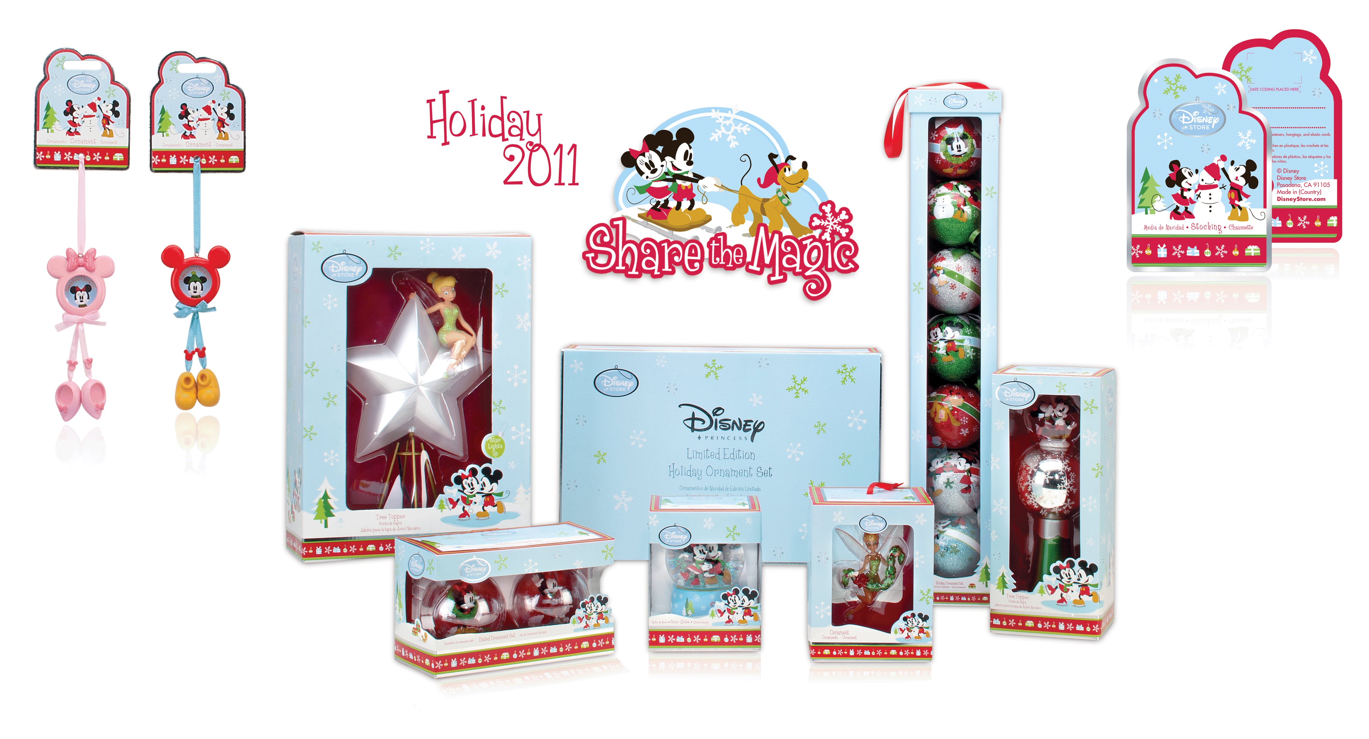
I had the pleasure of being lead designer on the Holiday Program for 3 years. For the 2011 program we decided to go with a fun, outdoor, family theme with the tagline "Share the Magic". To elevate the packaging I incorporated foil stamping, and spot varnishing on a matte finish. The spot varnish was added to the snowflakes, character art and logos to make them pop. The foil stamping was used as a framing device on the outer edges and logo frame.
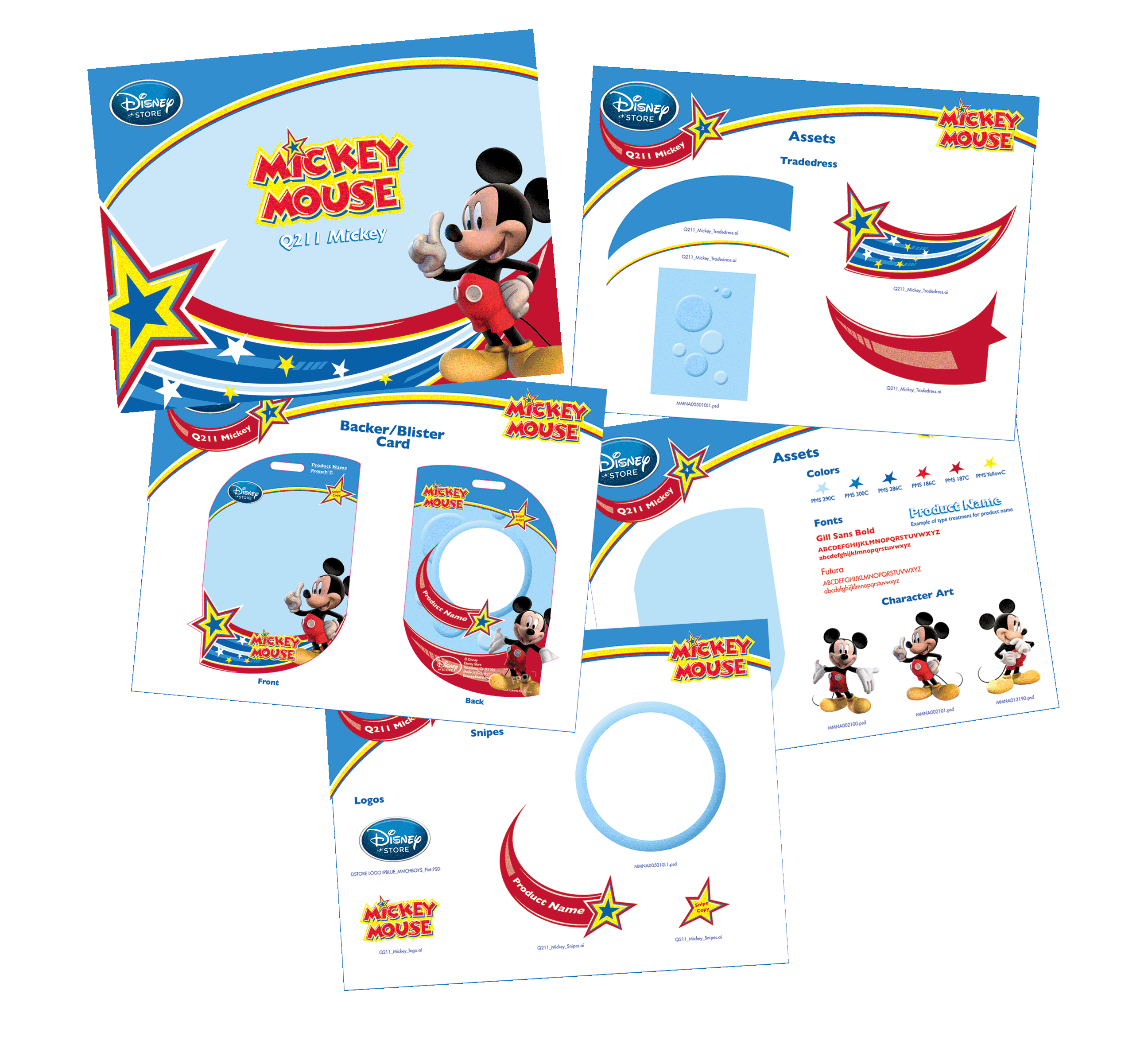
Designing the Mickey Mouse Magic Stars styleguide was especially fun since I had the opportunity to create all the assets other than the character art. For this program I wanted to incorporate movement with the shapes and stars along with adding a whole lot of fun!!!
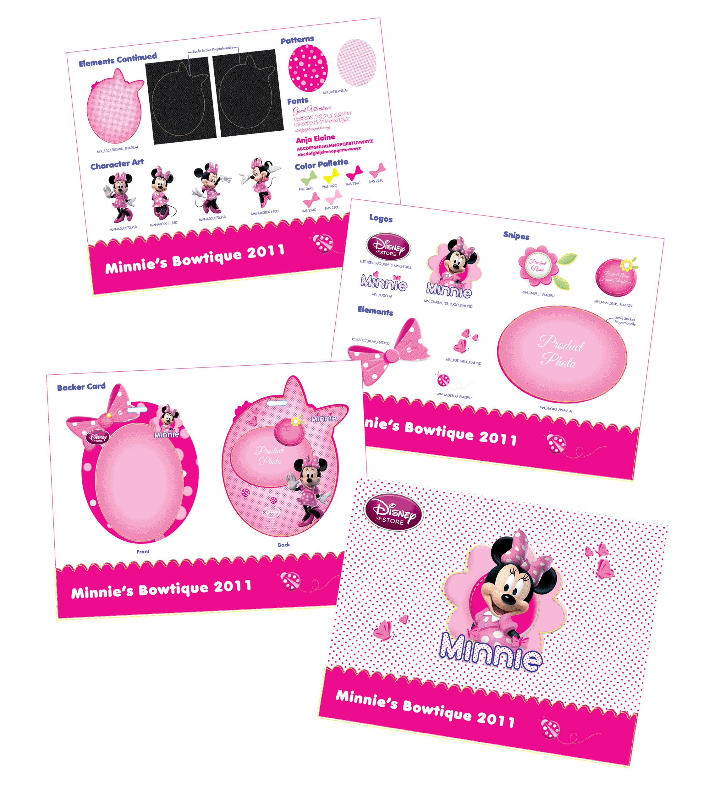
The Minnie Bowtique was another program that allowed for full design of the assets. The concept was cute, fun with elements of Spring. Pok-a-dots were incorporated to represent Spring and tie back to Minnie. The bow shape was used to add to the storytelling.
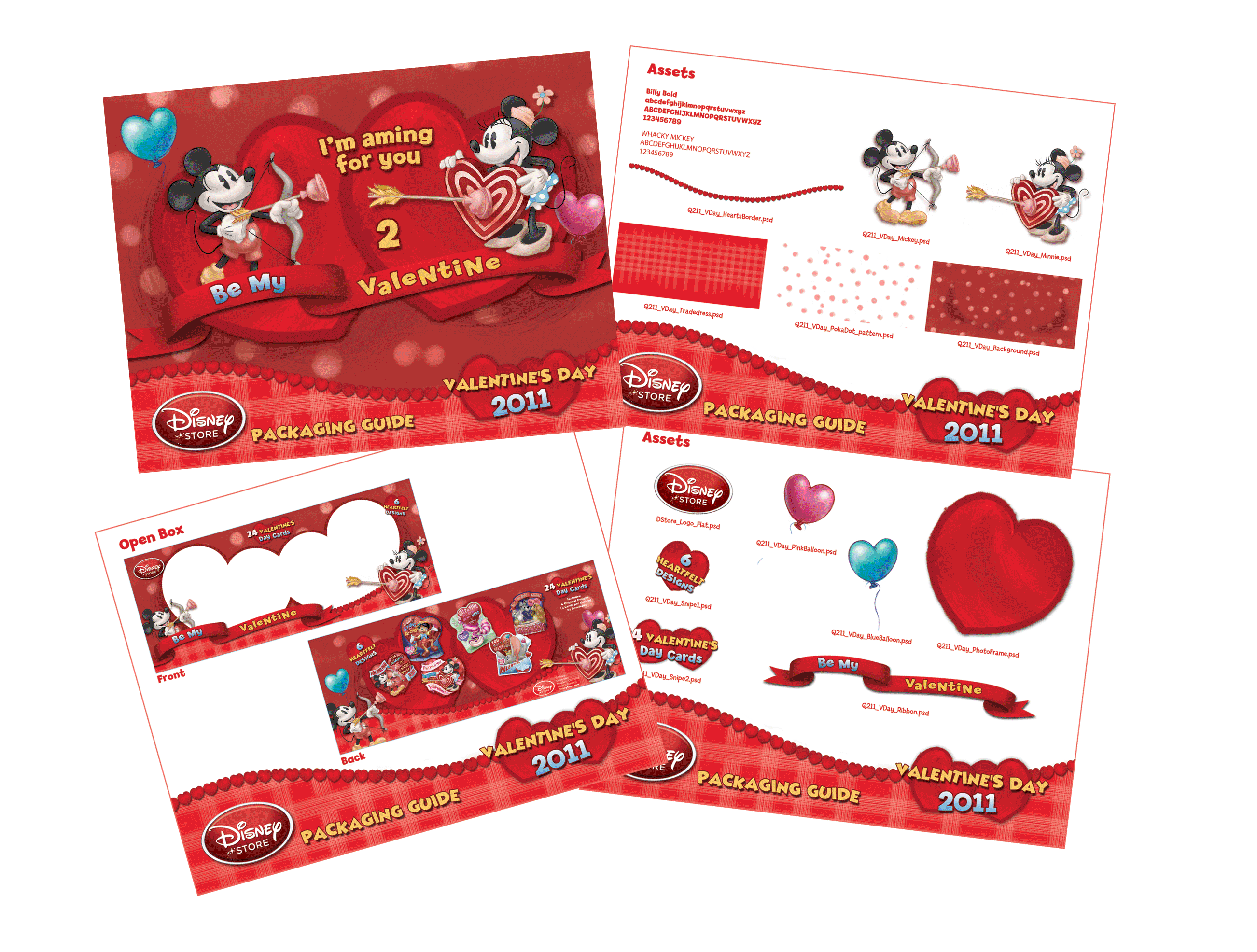
The Valentines Day branding was a small program with a whole lot of luv! I incorporated the use of heart shapes in many of the elements from the snipes and tradedress frame to the window diecut. I also added a brush feel to many of the elements to add texture and depth.

For the Wreck-It-Ralph branding guide adding an 80's 8-bit theme was crucial to the design. For the core branding I used multi colored squares in the background to tie back to the pixel based theme. To add exclusivity to flagship product I developed a specialty packaging look that used the 80's arcade game shapes for the packaging. The specialty branding was used throughout the talking figures line.